General Properties
Most objects have properties below:
Name
Specifies the name of the object as referenced in app project.
Use Name to change the name of an object to reflect its purpose in the
current app. By default, the IDE assigns sequential names based on the
type of the object, such as 'Button1', 'Button2', and so on.
DataSet
Set DataSet to the name of an existing dataset object (DBTable or
DBQuery) at design time. At runtime the data from a dataset object is
provided to the object.
FieldName
Specifies the field from which the object displays data.
Access by the object to the dataset in which the field is located is
provided by a DataSet object, specified in the DataSet property.
FontColor
Specifies the color for the Font.
FontSize
The height of the font in points.
FontBold
Determines whether the font is bold or not.
FontItalic
Determines whether the font is italic or not.
FontUnderline
Determines whether the font is underlined or not.
FontStrikeOut
Determines whether the font is displayed with a horizontal line through it or not.
TextAlign (TextHorzAlign and TextVertAlign)
Specifies the text alignment of an object within its parent.
To set the text alignment of an object, set the TextHorzAlign property
for the horizontal axis and the TextVertAlign property for the vertical
axis.
TextAlign can have the following values:
Value Meaning
Center The text is moved to the center of the parent area.
Leading The text is moved to the beginning of the parent area.
Trailing The text is moved to end of the parent area.
TextWordWrap
Specifies whether the text wraps when it is longer than the container area of the object.
Set WordWrap to True to allow displaying multiple lines of a text. When
WordWrap is True, the text that is too long for a container area wraps
at the right margin and continues in additional lines.
Set WordWrap to False for the text to span onto a single line. However,
in this case, the text that is too long for a container area appears
truncated.
Align
Specifies the alignment options (top, left, client, and so on) of the object.
Use Align to automatically set the alignment of the current object.
Setting Align to a value different than None can affect the position,
size (height and width), and anchors of the object. By default, Align
is set to None.
Enabled
Specifies whether the object responds to mouse, keyboard, tap and timer events.
Use Enabled to change the availability of the object to the user. To
disable an object, set Enabled to False. Some disabled objects appear
dimmed (for example: buttons, check boxes, labels), while others
(container objects) simply lose their functionality
without changing their appearance. If Enabled is set to False, the object ignores mouse, keyboard, tap and timer events.
To re-enable an object, set Enabled to True.
Visible
Specifies whether the object appears onscreen.
Use the Visible property to control the visibility of the object at run
time. If Visible is True, the object appears. If Visible is False, the
object is not visible.
Opacity
Specifies the object opacity.
Set Opacity to customize the transparency of the current object.
Opacity takes values between 0 and 1. If Opacity is 1, the object is
completely opaque; if it is 0, the object is completely transparent.
The values over 1 are treated as 1, and the ones under 0 are treated as
0.
Opacity applies to the container object's children.
Tag
Stores a integral value as a part of an object.
Tag has no predefined meaning. The Tag property can store any additional integer value for the convenience of developers.
ScaleX and ScaleY
Specifies the scale of the object.
Set the Scale coordinates to specify the scale on each axis.
The initial scale rate is 1 on each axis.
RotationAngle
Specifies the amount (in degrees) by which the object is rotated from the x-axis at runtime.
Positive angles correspond to clockwise rotation. For counterclockwise rotation, use negative values.
To set the rotation center, use RotationCenterX and RotationCenterY.
RotationCenterX and RotationCenterY
Specifies the position of the pivot point of the object.
The coordinates of the rotation center take values in the range from 0
through 1. The point with the coordinates (0,0) corresponds to the
upper-left corner of the object, the point with the coordinates (1,1)
corresponds to the lower-right corner of the object. The
default center of rotation is (0.5, 0.5).
Values outside of [0,0] and [1,1] are clipped.
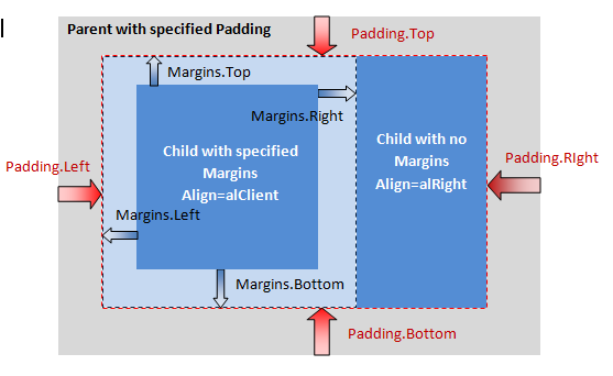
Margins (MarginLeft, MarginRight, MarginTop and MarginBottom)
Specifies the object's margins.
The Margins of an object are the distances (in pixels) from each edge
(top, left, bottom, right) to another object within the same Parent or
to the edge of its Parent. Margins adds space to the outer side of the
object.
If a margin is not 0, no other object will come closer to the object
than the specified distance. If the distance from a Parent edge to the
corresponding object edge is smaller than the specified Margins for
that edge, the object is repositioned and resized, if necessary, to
maintain the specified distance.
Padding (PaddingLeft, PaddingRight, PaddingTop and PaddingBottom)
Specifies the object's padding.
The Padding of an container object specifies how close, in pixels, the
container object's children can come to each of its edges (top, left,
bottom, right). Padding adds space to the inner side of the object.
The container object's children are repositioned and resized, if necessary, to maintain the Padding.
The following image shows how Padding and Margins properties affect alignment, position, and size of objects.
StrokeThickness
Specifies the width, in pixels, of the stroke outline to draw a line or a contour.
StrokeColor
Specifies the color of the stroke outline to draw a line or a contour.
FillKind
Determines the pattern for the fill brush.
Use Kind to specify the pattern painted by the brush. Kind can have one of the following values:
Value Meaning
Bitmap The brush's pattern is defined by an external bitmap image.
Gradient The brush's pattern is a gradient and you can set the gradient type and colors.
None The brush has no pattern. The fill of the object is transparent and the Color property has no effect.
Solid The brush's pattern is a solid color, which you can set by using the Color property.
GradientStyle
Determines the style for the gradient object.
Use Style to specify the direction of the gradient.
Style can have one of the following values:
Value Meaning
Linear The gradient is linear (top to bottom, left to right, top-left to bottom-right, etc.)
Radial The gradient is radial (concentric circles, with the center being a given point.)
GradientFirstColor
Specifies the first color of the gradient.
The GradientFirstColor property specifies one of the gradient's colors.
If Style is set to Linear, this would be the top color. If Style is set
to Radial, this would be the exterior color.
GradientSecondColor
Specifies the second color of the gradient.
The GradientSecondColor property specifies one of the gradient's
colors. If Style is set to Linear, this would be the bottom color. If
Style is set to Radial, this would be the interior color.
GradientStartPosition (GradientStartPositionX, GradientStartPositionY)
Specifies the starting point of the gradient.
Use the StartPosition property to specify the starting point of the
gradient. StartPosition is in unit coordinates, from (0,0) in the
top-left to (1,1) in the bottom-right of the rectangle being painted.
Changing the rotation of a linear gradient modifies these coordinates
so that the gradient goes in the desired direction.
Note: The changes made to StartPosition are visible only when the Style property is set to Linear.
GradientStopPosition (GradientStopPositionX, GradientStopPositionY)
Specifies the stopping point of the gradient.
Use the StopPosition property to specify the stopping point of the
gradient. StopPosition is in unit coordinates, from (0,0) in the
top-left to (1,1) in the bottom-right of the rectangle being painted.
Changing the rotation of a linear gradient modifies these coordinates
so that the gradient goes in the desired direction.
Note: The changes made to StopPosition are visible only when the Style property is set to Linear.
FillBitmap
Specifies the external bitmap object that defines a pattern for the fill brush.
Note: To properly use the FillBitmap property, you must set the FillKind property to Bitmap.
FillBitmapWrapMode
Specifies the wrapping mode for creating a fill brush pattern from an image.
The following table lists the possible values for the WrapMode property:
Value Meaning
Tile The image is used repeatedly to tile the area.
TileOriginal The image is used repeatedly at its original size.
TileStretch The image is stretched to fit the area.
Note: To properly use the FillBitmap property, you must set the FillKind property to Bitmap.
Position (Left, Top)
Specifies the upper-left corner of the current object, relative to its parent.
Position can be affected by the Padding of its parent and the Margins of the object.
Size (Width, Height)
Specifies the vertical and horizontal size (Height and Width) of the object (in pixels).
Use the Width and Height properties to read or change the size of the object.
|
|

